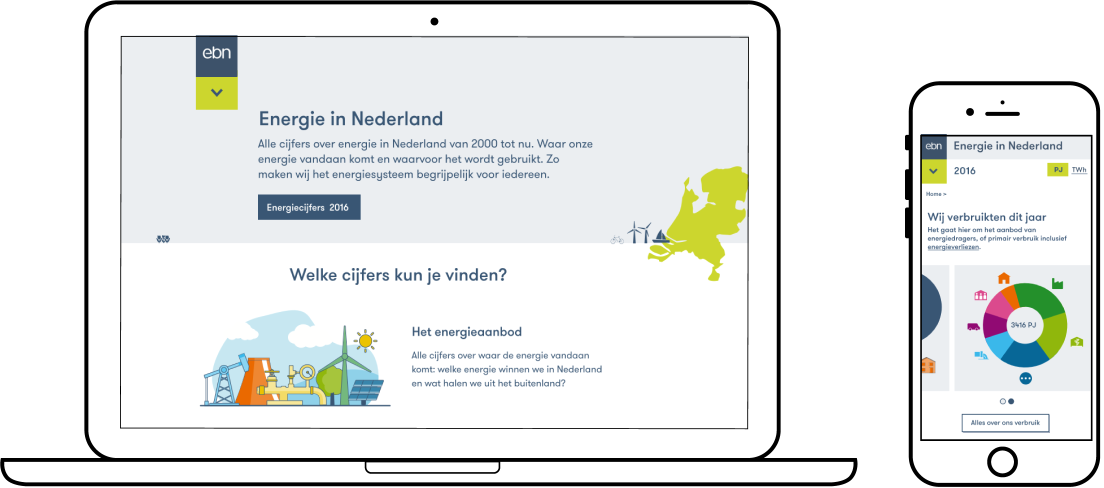
The main goal was to create a website that could help EBN inform and educate the public on the delicate and complicated topic of the energy transition (based on facts). I helped EBN get from an enormous data spreadsheet to an understandable online overview. A website that does not just show figures and trends, but also explains the energy system along the way.
visit energieinnederland.nl
hello. i am willemijn bins